Introduction to the Design of Everyday Things
My most recent online course is the Introduction to the Design of Everyday Things.
This course provides a summary of key concepts from the first two chapters of Design of Everyday Things (Revised and Expanded Edition, November 2013) by Don Norman. It’s intended to be enjoyable and informative for anyone curious about design: everyday people, technical people, designers, and non-designers alike.
In lesson one there is a section on Understandable and Confusing Design and we are asked to submit a photo and an explanation of a design we found understandable and one we found confusing. As I’m lazy, and the weather has been awful, I didn’t particularly want to go out and about too much. Originally I’d considered revisiting the ridiculous lights that accompany the security system at the office but instead decided to do a quick look at doors on shops between home and work.
I focussed on how clear the method of entry (i.e. pull or push) was. I ended up with a range of confusing photos and so I thought I’d write a blog post to accompany the exercise. By the way, I know that this isn’t a very original study, but as I mentioned above, I wanted something within easy reach of my home and office!
Confusing Design
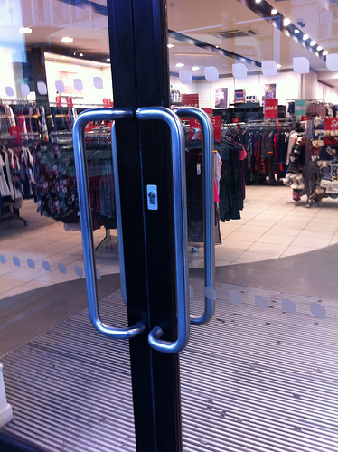
From looking at the door there is no way to work out without trying whether you should pull or push this door. The clues are that you’d pull, as there is a handle, but there is also a handle on the other side as well. So, it could be that this door actually opens both ways, in which case surely a push plate on both sides would be easier.
Acknowledged confusing design
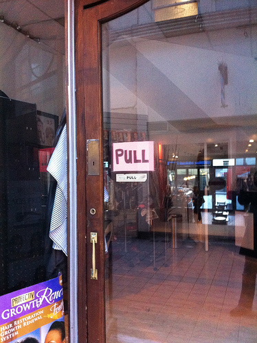
There are two pull signs on this door, one printed, one hand written in larger letters, so I’d guess the small one wasn’t working for them. Putting the Pull sign next to a flat plate, which in this case is the lock cover, only serves to confuse more (in my opinion).
More acknowledged confusing design
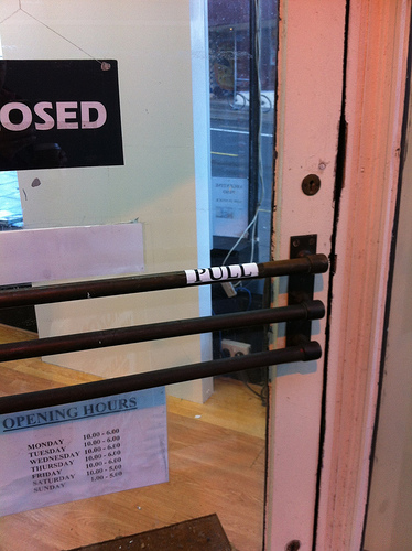
The store owner has added a Pull sign to the door. The three barred door handle looks a bit like something you’d push against, so I guess that the store owner got frustrated with people trying to push their way into his shop.
Understandable design
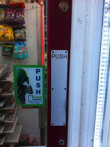
A push plate, which says Push on it. This is what I was looking for. The additional Push advert next to the door is a distraction, especially as Push is written downwards and needs a bit more processing to read, so it isn’t perfect either.
Ideal design
My ideal design would be a door that opens both ways, and that has a simple Push plate on both sides of the door. Pushing, to my mind, is easier than pulling especially if your arms are full of shopping. The Cafe Nero’s at the Western Road end of Preston Street has got this right. When you leave, holding your coffee, you push the door. No juggling of hot liquids required. I can’t remember whether there is a handle or not but I’ll probably notice next time I go in now.