What does a green light mean?
Towards the end of last year we had a new security system fitted in the office. To gain entry to the office put a fob against a contact plate and the door is unlocked. The fact that it is unlocked is indicated by this light above the door.
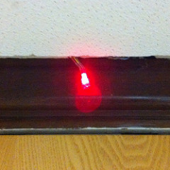
Yes, it’s a red light. To indicate that the door is now open.
When the door is locked, and we need to use our keyfob it looks like this.
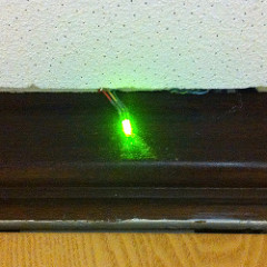
Yes, it’s a green light. To indicate that the door is locked.
When the engineer turned up to show us the system I asked him why the lights were this way around, he told me that it was because red was bad, and the fact that the door wasn’t secured was a bad thing.
When this system was being designed it was, evidently, only thought of from the perspective of people interested in knowing the state of the security of the office, not the day to day office worker.
Every time I walk up to the door and look at the light, I have to use a small bit of cognitive power to work out whether the door is unlocked or not because from my perspective red means stop and green means go. Surely, that small amount of cognitive power would be better spent working on something to benefit the business, rather than working out whether I need to get the key fob out of my pocket. As Steve Krug says about usability on the web “Don’t make me think”.
(This has been winding me up for a while, but I thought it emphasised the point about having user awareness of all your consumers, not just the ones who have commissioned the service)