On "The Return of the Scroll" and my input on the pagination vs scrolling conversation
The other day, in my twitter feed, retweeted by @arhomberg, was this:
Usability post: The return of the scroll usabilitypost.com/2012/10/29/the…
— Tim Spalding (@librarythingtim) November 3, 2012
and the article sounded interesting so I took a look.
Disclaimer: I don’t have iOS6 on my iPad (I’m a bit scared of getting maps that don’t work) so haven’t experienced the scroll in the books app and am therefore responding to the article rather than my experiences. Also, the books app isn’t my reading app of choice, I’ve been using ReadMill for most things.
I’m a fan of the scrolling metaphor. I’m used to reading longer form text using a scrolling mechanism via a browser, or instapaper. I’m also used to using page turns in both analogue books and on my kindle.
I took a few moments to see which of the non-supplied iPad apps I use makes use of which page turn mechanism:
- ReadMill - page turn
- Flipboard - a mixture (see below)
- Instapaper - page turn (I hadn’t realised this until I started writing this - I mainly read Instapaper articles via my kindle and use the iPad interface to quote extracts from or to mark them as read) or automatic tilted scrolling (which I’ve never got on so well with)
- reeder - scroll
So, the majority of apps I’ve installed use a page turning mechanism. Before looking I would have said they used scrolling. I do find that the device influences my expectations, and I’ve always found the page turn mechanism on my iPhone or iPad cumbersome, preferring to scroll (especially if the application has an overly animated page turn interface!) even if my app choice doesn’t necessarily back that up.
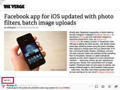
I find flipboard to be the one app which seems undecided and inconsistent - some content scrolls, some has been paginated. As a user I need to determine this on a per article/piece of content basis and adjust my interaction accordingly. This doesn’t seem great. If I have to learn an interaction or gesture for an app, it should be used consistently throughout that app. Also the page number information is displayed in different areas depending on the content provider, which again doesn’t help. See some examples below:

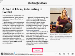
and a scroll example:
I have a 3rd generation kindle. It has page turn buttons. These work fine and my kindle is my reading apparatus of choice for long form text. My fingers don’t get in the way of my reading experience, neither do I need to hold the device in a particular way other than to be able to touch one of the buttons on either side of the screen. The following paragraph taken from the original article is quite interesting and gives context around this design decision:
Due to the technical limitations of the time it didn’t have a touch screen and relied solely on physical buttons for navigation. While you can implement a scrolling interface with physical buttons, the slow page refresh rate of the e-Ink display would make the experience of going up and down very laggy and unpleasant. This leaves page navigation as the only viable option since a single button will now be pushing a whole page load worth of text, and so would not need to be pressed as much. The scroll interface just wasn’t an option.
From my perspective, a lot of long form text is linear in nature. So let me, as the user, interact with it in that manner. Scrolling does that. Page turning doesn’t as it artificially breaks the text into chunks. And depending on my font choice, or the app I choose to read the text in, those page breaks will be different. This has made me wonder if, in a similar way to in giving presentations and holding attention, there is significance in breaking the work up beyond chapters and if authors consider page endings in a similar way to chapter endings. I suspect not. This is also mentioned in Scrolling or paging? where it says:
Authors don’t write in pages, they write in sentences and paragraphs, neither of which are honored in a paged interface.
If the text isn’t linear then it’s time to think of alternative display mechanisms, or augment the linear version (table of contents or index for instance, or embedded links). Like the iPad app for Composition No 1 which flicks through the “sheets of paper” until you put your finger on the screen. Confession: I haven’t read many of the individual stories as I find the interface uncomfortable - I don’t want to have to have my finger resting on the screen whilst I read, and when I have tried my finger slips off the screen changing the text displayed. For me, this isn’t a very usable interface, but it is, at least, one that attempts to present the content in the way it was envisaged.
When Amazon started putting page numbering into ebooks I thought it was odd. The “page” I read a piece of information on isn’t relevant to me. It’s a frequent progress tracker but a percentage works just as well. But I can see why it is relevant to others, it’s summed up nicely in this paragraph from the wired article:
One big complaint about e-readers is that their page numbers don’t correspond to the page numbers in a printed book. This makes it tricky to match where you are if reading in E Ink and regular ink, and also makes referencing passages very hard. (It’s a pain if you’re discussing the book in a class or book club where some people are reading in one format and some in another.)
but even then, even within the context of a book club, different versions of the same book may have different page numbers. Page number isn’t a great way to refer to a section of a book, or to quote from it. It’s a method we adopted because of the shortfall of the physical page and book, not because it’s the best or most accurate way of referencing it.
Maybe it is a preference thing - do I (think that I) prefer to scroll because scrolling was the first experience I had with a digital book (which was in 2001 on a palm pilot professional whilst travelling in New Zealand)? If you’ve only ever flipped a page on a touch device, is that more natural?
Either way, I do like progress indicators - either the nice little content blobs (as in Instapaper) or screen numbers (as in readmill), or a visible scroll bar (and not an infinite scroll bar either - I want to see where I am up to, I like the feeling of progress and knowing how long I have to go - should I take a break now to make that cup of tea, or shall I finish the article first?). Some example screenshots follow:
Instapaper:
Readmill:

Rian says this on the progress thing (obviously preferring pages):
pages allow us to hang on to some sense of beginning and end. They communicate a solid sense of progress. They serve as signposts to help us figure out where to stop reading until the next time
and
In short, pagination lets you know that you’re getting somewhere, and not just running on a treadmill.
And on infinite scrolling, I love the quote from Rian:
Scrolling is exhausting — it never ends. There is no sense of accomplishment. I once heard someone refer to infinite scrolling on websites as “a game you can never win.”
As for my thoughts after reading and writing this, well, I think I’ll take consistency. Across content within an app? absolutely. Across apps within a device? preferably. Across different devices? Not so bothered, as long as consistency within the device/app is there. I can adapt. Human’s have adapted for years, I hope that doesn’t stop anytime soon.