On ”no photography”
I’ve had a draft blog post sitting around for almost a year with this title, and yesterday’s experience at the Hayward Gallery’s excellent Light Show has triggered me to actually write it properly.
The original post started as:
I’ve been to a few exhibitions and galleries recently and in (almost) every one has been the “No photography” sign with absolutely no guidance applied as to what this applies to - is it the art work, the associated media, the layout of the exhibition, the interesting cornices in the architecture of the room? It is just a blanket ”No photography” sign. I fully appreciate the idea of copyright, and understand the restriction from that perspective, and I also understand that a blanket ban is easier to enforce but I can’t help feeling that some guidance would be handy.
Personally, in the majority of cases, I want to take a quick snapshot of of the notes next to a piece in order to be able to look the artwork up later, to find more about it and maybe to write about my reaction to it. Nobody seems to object to me pulling out a notebook and pen and writing down the notes word for word, but I’m not allowed to photograph them.
As a result of my Light Show experience I have a further understanding of this, and whilst they did a reasonable job the attendants couldn’t be everywhere at once. The concept and premise of the light show is that the exhibits all feature some form of illumination. They are designed to be focal points. The show “explores how we experience and psychologically respond to illumination and colour”. They are not designed to compete with little white rectangles of mobile phone illumination. It didn’t spoil my enjoyment of the exhibition, but it did make me think more about that “No photography” sign and situations where a blanket ban is not just easier to enforce, but also allows an exhibit to be experienced in the manner that the gallery/artist intended.

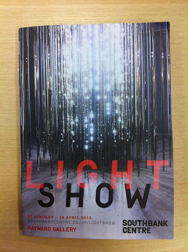
As we entered the exhibition we were handed a small booklet which has an image and description of the work being displayed. This isn’t the first exhibition I’ve been to that does it, but I do think it is a really good thing - a combination of souvenir, and memory prompt all in one. This meant I didn’t feel the need to either get a camera out to record the details of a piece I really liked (my favourite, incidentally, was Jim Campbell’s Exploded View (Commuters)) in order to be able to link to it here later or to get my notebook and pen out and jot down details of other exhibits I enjoyed.
I rather like it when my perspective on things is challenged, and this did just that. Maybe not as the curators of the exhibiton intended, but it triggered further thoughts and a reaction.