My end of MapMOOC mapping submission
As the final assignment of the latest MOOC I’ve been doing — Maps and the Geospatial Revolution — I needed to create a map which told a story. I’d briefly looked into what open data I could get online and wasn’t overly excited about any of it. As it was a lovely evening, and we’d already decided to go for a post-work dog walk I decided to combine the walk with some mapping.
So, after a super speedy bit of research and a quick review of the MOOC page on collecting your own data I headed out armed with my iPhone, some apps (mentioned in detail below), and a good old notebook and pen. Oh and the dog of course.
The story
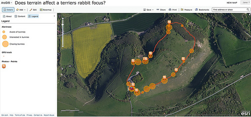
Our dog is a terrier, and she loves all woodland animals. The place we were going for our evening walk has bunny rabbits aplenty. So I decided to track her bunny-awareness to try and work out whether ground cover made a difference to her alertness.
I measured her alertness on a scale of 0 - 3 which is worked out as follows:
* 0 - no interest, no bunny sniffing happening
* 1 - moderately alert, sniffing the air, but not tugging uncontrollably at the lead
* 2 - high alert, lots of sniffing, some tugging, but still responds when called
* 3 - down a hole, forgotten our existence
In the field
I initially set a timer for every 5 minutes to take an alertness reading, but it soon became apparent that this wasn’t going to be often enough. So, I did try and take them at regular intervals but also took them in between when her state changed. I noted down the time, longitude, latitude and alertness using a notebook and pen and the iPhone app GB Locate. I used the iPhone app Sports tracker to trace our route. I took some photos using the iPhone app Pro-Camera and stored them as geo-tagged images. The intention of these was to help illustrate her state. I failed to take an image every time I took a note of her state as sometimes she was just TOO interested in those bunnies.
Back at home
I exported my sports tracker trace as a gpx file. Richard transcribed my scribbles into a csv file for me. I uploaded these images to flickr, and then made use of the geoRSS format for the set.
I used ArcGIS Online to make my map as this is what we’ve been using throughout the course. I chose a base layer which shows satellite imagery, as this helps to show terrain and to differentiate between woodland and open areas. Flickr imagery is always imported using the RSS icon - or at least I couldn’t find a way to change it - so I decided to use orange/red as the prime colour for my observation data and gps layer as well. I chose to represent the different observation data values using a standard deviation circle as this would help identify the areas of prime interest to Skitters. I found ArcGIS Online to be feature rich, but crashy. I swore a lot. And was still working on my map at 11pm as I made “just one more change” and then promptly had to remake the previous three or four changes. I’d recommend saving often if you choose to use ArcGIS Online.
Review
This assignment was peer reviewed by 4 other participants and by myself. My review was:
I considered using an alternative symbology for the “bunny awareness” - for example a differing size of bunny - but I ran out of time before finding a suitable image to use. This would have improved the map. I would have preferred to have used a different symbol for the flickr images, but failed to find a way to do it. I was pleased to work out how to change the detail shown based on the zoom level. So when zoomed in it shows all the data layers, but at greater distances, it just shows the gps tracking. I felt that this made a much better use of the screen. I think my summary is reasonably well written, and explains what I was trying to do. More evenly distributed data points in the woodland area would have been a good addition to the story. Overall, and in comparison to the maps I’ve just evaluated, I think it stacks up quite well.
Today I got to look at the comments from my peers, and I’m really pleased with them.
Peer 1 said:
I adored this very clever story map! Tracking your dog tracking bunnies – who would’ve thought?? The use of an aerial view works well, and gives the viewer a sense of the landscape. My only observation would have been greater differentiation of the various states – I might have opted to use red/orange/yellow variations to illustrate the levels, as the circles are a bit close together as some scales. But otherwise a nice approach.
which is lovely because it has some things to think about and to take on board.
Peer 2 said:
Great hilarious idea! Very funny and good execution. I liked it.
which made me smile.
Peer 3 said:
The best of the three! Original and complete.
still smiling.
Peer 4 said:
Enjoyable map of an owner GPSing their dog and the dogs attention to rabbits
and ending with a smile.
Summary
My desk buddy is a cartographer and so today I got him to review my work. He mentioned the idea of using colour as well as size as per Peer 1. He also suggested using arrows or similar to indicate the direction of the walk to improve the story. He was also keen to emphasise the importance of title, summary and meta data in the use of maps - these weren’t items considered as part of our peer review which I guess is the difference between a learning exercise and a proper piece of map making.
The course has been great, and has given me additional appreciation of the skill of people, such as the above-mentioned cartographer, in making maps which are clear and easy to use.