Atlas of Design
I bought a copy of Atlas of Design (volume 1) for Richard for Christmas. Well, I say I bought it for Richard. I gave it to Richard, but if I’m entirely honest, I probably bought it for myself.
It’s a beautiful book, with lovely maps - as perhaps you’d expect. And because there is a page of text, by the cartographer, to accompany each map, it is a pleasure to read as well.
What follows are some of my highlights (attributed and linked to maps/further information where possible)):
From the introduction:
Design and aesthetics matter, because form is not secondary to function; form is integral to function. A map cannot function if it remains unread. To truly engage map users requires that we present them with something worth looking at. Something that they will want to spend time studying. Something that acknowledges the human need for beauty. Something that causes the user to think about the map in terms beyond whether or not it simply ‘works’
From “Locals and Tourists” by Eric Fischer (sample image of London below)
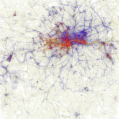
I used blue and avoided green because red and blue provide a much better contrast to my colorblind eyes than red and green do
I’d never even given considered the impact of colour blindness on cartographers before.
From “Here Now! Social media and the psychological city”
The motivation behind these broadcasts vary between the two social media sites. Foursquare users tell us more about the mundane nuances of life - where their bed is, where they get their morning coffee, or where they work. Facebook users tend to use the site to brag about iconic places they have been to: Times Square, Little Italy, or the Empire State Building. Both sites tell us how social media users explore the city, or, more importantly, how they broadcast their exploits.
I thought it was pretty interesting to see a data-based view on the intent behind check-ins before.
From “Panoramic map of Mount Washington”
In my design process I carefully manipulated color and composition to help tell the story. The primary subject matter of the map, locations of all deaths on the mountain from 1849 until 2008, compelled me to push the color into a more somber space than most maps I have designed
I’ve been to many ski resorts in my time, all of which have panoramic mountain maps. They aren’t vastly different to this one, but they are usually less somber, and more playful. So I’d say the colour choice has helped here.
From “A Taxonomy of Transitions” by Bill Rankin of Yale University
we need to think carefully about how we map social statistics, since the way we make maps influences the way we think about spatial planning and design. Right now, almost all planning is done using sharp boundaries, be they the boundaries of neighborhoods or entire countries. What would happen to our political understanding - or to our political interventions - if we made maps without solid colors?
So, all in all a beautiful book which is well produced and worth existing in a physical form. I can’t help wishing it was available as an exhibition as well as I’d love to see some of these maps reproduced on a much, much larger scale.